As I mentioned in my last blog, X_STUDY® charts offer more than traditional bar data. Along with the open, high, low, close and volume for each bar, we have a list of volume at each traded price. This list is commonly referred to as Volume at Price, or VAP, and can be visually displayed on an X_STUDY chart. The VAP data is then used to calculate many key technical price levels like Volume Weighted Average Price (VWAP), Volume Point of Control (POC) , Value Area High (VAH) and Value Area Low (VAL).
VAP
Let’s look at VAP before we explain these important daily price levels. VAP is generally plotted on a chart to view which price levels have attracted high-volume trading and which price levels have relatively low volumes. These high- and low-volume areas often form bell-shaped curves turned on their side, and are commonly referred to as volume profiles.
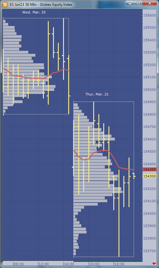
Figure 1 shows an example of the profile made on a 30-minute bar chart with the VAP indicator configured to group each daily session. I am using X_STUDY 7.8, which we just released. This version has the ability to display the volume labels at each price, as in Figure 1 below.
 |
| Figure 1: June 2013 S&P E-mini contract with daily VAP groups. |
VAP Calculations
Now on to the calculations that are derived from VAP. One of the most highly used calculations from VAP data is the Volume Weighted Average Price, or VWAP. This calculation sums the results of the volume at each price multiplied by the price, then divides the sum by the total volume over the interval. You can see the formula here.
In Figure 2 below, we add the VWAP to the chart. This red line shows how the VWAP developed through the day. You will often find high-volume trading and good support and resistance at these levels since this value is used as a benchmark at many large trading institutions.
 |
| Figure 2: Daily VWAP added to the chart. |
Figure 3 adds the maximum VAP, or Volume Point Of Control (POC), to the chart. This is simply the price that has the highest volume value for the defined group. Notice I called this Volume POC. If you are familiar with Market Profile charts, you know they too have a POC based on Time Price Opportunity (TPO) count. I’ll save these charts for a later blog.
 |
| Figure 3: Maximum VAP, or Volume POC, highlighted in yellow. |
The next calculation is going to be a little harder for me to explain without this blog becoming too lengthy, but I’ll give it a try. Value area, or volume value area since these calculations are going to be done on the VAP dataset, is an algorithm that calculates 70 percent of the volume. I rounded up to 70 percent from the original standard deviation worth of volume, which was 68 percent.
The algorithm starts by finding the volume POC, then adds two volume price levels above or two volume price levels below the POC to the value area. We add the group with the largest volume. For example, if the two price levels above the POC add up to 10,000 volume and the two price levels below add up to 9,500 volume, then we add the top two price levels to the value area. The 9,500 will then be compared to the sum of the next two VAP values above the 10,000 group. Again, the larger of the two amounts is added to the value area. The algorithm continues adding volume groups until reaching 70 percent of the volume.
 |
| Figure 4: The value area is highlighted in green. |
See Figure 5 for a fast-action volume profile chart. This is a two-minute bar chart with VAP group size of 15. We are now grouping or displaying the volume profiles for each 30-minute bar. The chart also displays the daily VWAP and TT CVD® indicators.
 |
| Figure 5: A faster VAP indicator setup. |
X_STUDY® 7.8.0 Release
This concludes X_STUDY’s extended set of market data points; but wait, there’s more! With the new release of X_STUDY 7.8 on May 8, we have exposed the above additional calculations for each bar to be used by all of the technical indicators.
That’s right, each bar now has a VWAP, maximum VAP, value area high and low along with the open, high, low and close. This revolutionizes all of X_STUDY’s technical indicators. We haven’t changed the formulas for the existing indicators. We are simply exposing these new bar data points, which are a little more intelligent.
For example, a simple moving average is generally calculated on each bar’s closing price. Now X_STUDY users can choose to use the maximum VAP instead of the close for the bar. How about a 50-day VWAP moving average instead of a 50-day closing price average?
How about using the stochastics indicator and defining the high as the value area high, the low as the value area low, and the close as the maximum VAP of the bar? This turns the stochastic indicator into a stochastic indicator based on each bar’s value area instead of the bar’s high and low.
I could go on and on here, but I will stop now. I’ll be showing more features of X_STUDY 7.8 in my next blog. Until then, I hope the above feature sounds interesting and leads you to try our latest release of X_STUDY.