← Back to Trade Talk Blog
It started innocently enough last summer. A consecutive string of down days, followed by a bounce.
The bounce low was quickly taken out with price pushing below $100, and then stabilized for a few days. No one really noticed, nor were there major concerns. “Crude’s back in the $90s, this is great! Gotta go fill up the SUV!”
And then a steady downward drift lower continued into autumn. The move to lower prices was relentless and morphed into a steep cascade down to below $50. Check out this price chart of the front month WTI crude oil futures over the past two years:
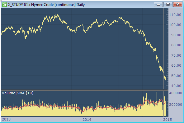
The remarkable downward price slide in the price of crude and its related impacts are now front-page news. I’ll let the experts debate the reasons why prices have been cut in half in just a few short months, and let others prognosticate on when it will stabilize. What I would like to do here is comment on some interesting phenomena that have occurred and a few reasons why all this is good for the futures industry.
Continue Reading →
Tags: Charting
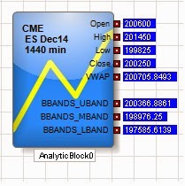 |
| Figure 1: TT Analytics in ADL. |
With the release of X_TRADER® 7.17.40, TT introduced a new feature in ADL® named TT Analytics. This feature uses a single block that brings a historical data solution to ADL along with a suite of technical indicators. It provides almost every value found in an X_STUDY® chart to your server-side algo. In this blog post, I will introduce the block while demonstrating how to find some important trading reference points.
The TT Analytics Block can be found under Misc. Blocks on the left side of the ADL Designer Window. You simply drag this block onto the canvas and double click it to expose the properties page. If you’re an X_STUDY user, the properties page will look familiar to you. Here you can add technical indicators and expose bar values such as open, high, low and close.
Figure 1 above shows the block with open, high, low, close and VWAP for the current daily bar of the December ES market. It also shows the Bollinger Bands technical indicator added to the block.
Next, you add an Instrument block to the TT Analytics Block from within the properties page and define the type of bar data you want returned. Once this is complete, you can go in either of two different directions: you can add a technical indicator to the block or expose more bar data.
Continue Reading →
Tags: Algos & Spread Trading, Charting, Trade Execution
Have you ever wanted to buy something in one location to sell it in another location at a higher price? Imagine buying gold on CME only to turn around and sell it on TOCOM at a higher price. This type of trade is known as geographical arbitrage.
While there is risk in every trade, geographical arbitrage is relatively low risk. The faster you can execute and the more alike the underlying products, the better the arb. Gold as an underlying makes for an almost perfect hedge, as the gold quality is identical. This is not true for most other commodities.
One major factor here is the two products are priced in different currencies. A currency conversion is required, and this conversion value is not static like some other conversion factors used for spreading. For example, in this spread, I will use a static conversion of 1 kilogram equal to approximately 32.15 troy ounces. This value will not change during my arb, but the dollar-to-yen ratio will.
Let’s begin by calculating how to set up this trade. I will convert the yen-to-dollar using 6J on CME and grams to troy ounces. Below is a table that shows this conversion to get TOCOM gold priced in U.S. dollars and troy ounces.

Continue Reading →
Tags: Algos & Spread Trading, Charting, Trade Execution
With the release of X_STUDY® 7.8.0, users of our charting application can now apply a technical indicator (or study) to the value of another technical indicator. Although this feature can be used in many ways, two primary ways are to help measure market conditions and increase or improve trading signals. I’ll show a few simple examples of this feature, which we call study on study.
Measuring Market Conditions
A classic study on study is to place a moving average on the volume indicator. Averaging the last few volume bars helps to gauge what kind of tempo the market is experiencing relative to the past. In addition, volume levels are compared to averages, especially at highs and lows.
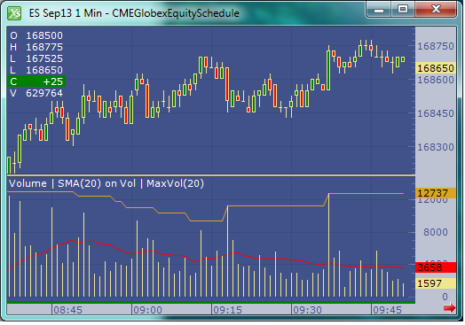 |
| Figure 1: One-minute September E-mini S&P 500 chart |
Figure 1 above shows a chart with a red moving average placed on the volume indicator. Notice I also added a second study on study with an orange max indicator applied to volume. This max study simply finds the maximum value over the user-defined look-back period. Both the simple moving average and the maximum indicators are looking back 20 bars.
Continue Reading →
Tags: Charting
As I mentioned in my last blog, X_STUDY® charts offer more than traditional bar data. Along with the open, high, low, close and volume for each bar, we have a list of volume at each traded price. This list is commonly referred to as Volume at Price, or VAP, and can be visually displayed on an X_STUDY chart. The VAP data is then used to calculate many key technical price levels like Volume Weighted Average Price (VWAP), Volume Point of Control (POC) , Value Area High (VAH) and Value Area Low (VAL).
VAP
Let’s look at VAP before we explain these important daily price levels. VAP is generally plotted on a chart to view which price levels have attracted high-volume trading and which price levels have relatively low volumes. These high- and low-volume areas often form bell-shaped curves turned on their side, and are commonly referred to as volume profiles.
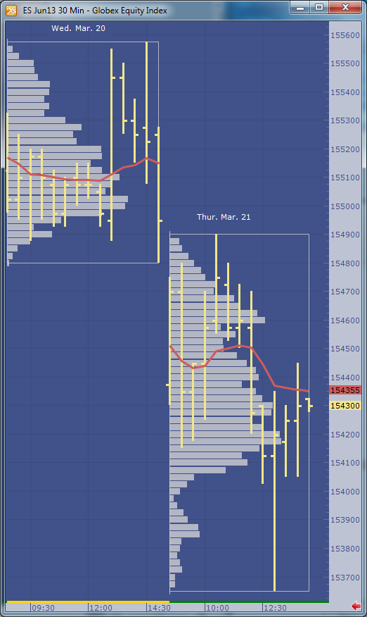
Figure 1 shows an example of the profile made on a 30-minute bar chart with the VAP indicator configured to group each daily session. I am using X_STUDY 7.8, which we just released. This version has the ability to display the volume labels at each price, as in Figure 1 below.
 |
| Figure 1: June 2013 S&P E-mini contract with daily VAP groups. |
In evaluating volume profiles, one can apply principles similar to
Market Profile® theory. VAP can show additional details not found in profile analysis, too. Look at Figure 1 on March 21. There was a single 30-minute bar forming the day’s low. Notice the heavy volume at 1538.50 and 1538.75 compared to the other price levels during this 30-minute period. This is something you could not see with a standard chart or a Market Profile chart.
VAP Calculations
Now on to the calculations that are derived from VAP. One of the most highly used calculations from VAP data is the Volume Weighted Average Price, or VWAP. This calculation sums the results of the volume at each price multiplied by the price, then divides the sum by the total volume over the interval. You can see the formula here.
In Figure 2 below, we add the VWAP to the chart. This red line shows how the VWAP developed through the day. You will often find high-volume trading and good support and resistance at these levels since this value is used as a benchmark at many large trading institutions.
 |
| Figure 2: Daily VWAP added to the chart. |
Figure 3 adds the maximum VAP, or Volume Point Of Control (POC), to the chart. This is simply the price that has the highest volume value for the defined group. Notice I called this Volume POC. If you are familiar with Market Profile charts, you know they too have a POC based on Time Price Opportunity (TPO) count. I’ll save these charts for a later blog.
 |
| Figure 3: Maximum VAP, or Volume POC, highlighted in yellow. |
The next calculation is going to be a little harder for me to explain without this blog becoming too lengthy, but I’ll give it a try. Value area, or volume value area since these calculations are going to be done on the VAP dataset, is an algorithm that calculates 70 percent of the volume. I rounded up to 70 percent from the original standard deviation worth of volume, which was 68 percent.
The algorithm starts by finding the volume POC, then adds two volume price levels above or two volume price levels below the POC to the value area. We add the group with the largest volume. For example, if the two price levels above the POC add up to 10,000 volume and the two price levels below add up to 9,500 volume, then we add the top two price levels to the value area. The 9,500 will then be compared to the sum of the next two VAP values above the 10,000 group. Again, the larger of the two amounts is added to the value area. The algorithm continues adding volume groups until reaching 70 percent of the volume.
 |
| Figure 4: The value area is highlighted in green. |
In X_STUDY, the VAP indicator is highly customizable. For example, if you want to highlight only 50 percent of the volume for the value area calculation, you can simply change it in the VAP indicator properties. If you want to change the grouping for the VAP, you can do that too.
See Figure 5 for a fast-action volume profile chart. This is a two-minute bar chart with VAP group size of 15. We are now grouping or displaying the volume profiles for each 30-minute bar. The chart also displays the daily VWAP and TT CVD® indicators.
 |
| Figure 5: A faster VAP indicator setup. |
X_STUDY® 7.8.0 Release
This concludes X_STUDY’s extended set of market data points; but wait, there’s more! With the new release of X_STUDY 7.8 on May 8, we have exposed the above additional calculations for each bar to be used by all of the technical indicators.
That’s right, each bar now has a VWAP, maximum VAP, value area high and low along with the open, high, low and close. This revolutionizes all of X_STUDY’s technical indicators. We haven’t changed the formulas for the existing indicators. We are simply exposing these new bar data points, which are a little more intelligent.
For example, a simple moving average is generally calculated on each bar’s closing price. Now X_STUDY users can choose to use the maximum VAP instead of the close for the bar. How about a 50-day VWAP moving average instead of a 50-day closing price average?
How about using the stochastics indicator and defining the high as the value area high, the low as the value area low, and the close as the maximum VAP of the bar? This turns the stochastic indicator into a stochastic indicator based on each bar’s value area instead of the bar’s high and low.
I could go on and on here, but I will stop now. I’ll be showing more features of X_STUDY 7.8 in my next blog. Until then, I hope the above feature sounds interesting and leads you to try our latest release of X_STUDY.
Tags: Charting